What Fonts Are Used in Apple Products: The Importance of Font in Design
Apple Inc., known for its sleek design and user-friendly interfaces, places significant emphasis on its choice of fonts. This article explores the various fonts used across Apple’s product range and discusses why font choice is crucial from a design perspective.
Overview of Popular Fonts in Apple Products
Apple has employed a variety of fonts throughout its history. These include, but are not limited to, San Francisco, Helvetica Neue, and Myriad. Each font is chosen for its readability, aesthetic appeal, and alignment with Apple’s design ethos.
iOS System Fonts
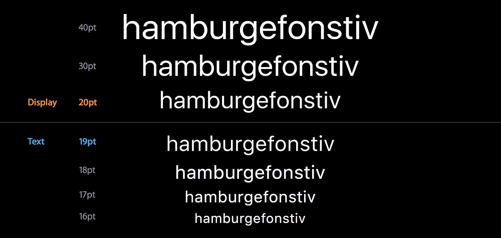
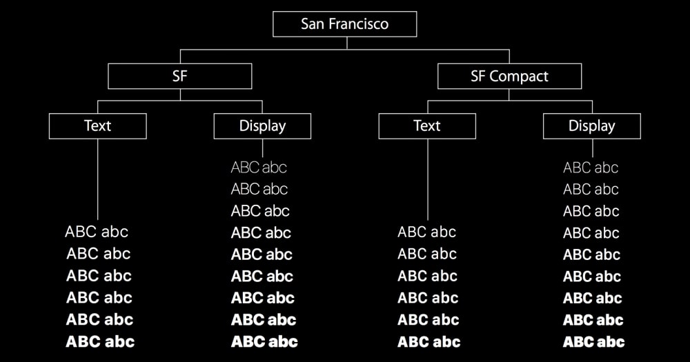
For iOS, Apple introduced the San Francisco font in 2015. It replaced Helvetica Neue and was designed for maximum clarity and readability on small screens. San Francisco is characterized by its clean lines and neutral style, which complements the simplicity of Apple’s user interface.
macOS System Fonts
On macOS, San Francisco is also the system font, ensuring a consistent user experience across Apple devices. Its scalability and legibility make it an ideal choice for the high-resolution displays of Mac computers.
Fonts for Logos
Apple’s logo has seen different fonts over the years. For instance, the company used Garamond in its logo for nearly two decades before transitioning to Myriad. Apple’s current logo, however, doesn’t feature a wordmark, focusing instead on its iconic bitten apple symbol.
Fonts for the Interface
Apple’s user interface fonts are designed to be unobtrusive and legible. San Francisco is primarily used across iOS and macOS interfaces for text like menu items and notifications. This consistency in font usage contributes to a cohesive user experience.
Fonts for Marketing Materials
In its marketing materials, Apple has traditionally used Myriad, a sans-serif typeface known for its warmth and clarity. However, recent marketing has seen a shift towards San Francisco, reflecting a unified brand identity.
Fonts for Web Development
For web development, Apple recommends using the system fonts of iOS and macOS. This ensures that web content aligns with the overall aesthetic of Apple devices, providing a seamless user experience.
Fonts Used by Top Casinos
In the world of online casinos, the choice of font is crucial for user engagement. Many operators use clear, readable typefaces such as Arial and Verdana, while others commission custom fonts that reflect their visual identity. Effective typography must remain easy to read across desktop and mobile screens, including in compact areas such as game menus, account sections, payment forms, and responsible-gaming notices. A clear hierarchy of headings, labels, and body text helps visitors scan information quickly and understand which actions are available. Font size, line spacing, character spacing, and contrast also require careful attention, particularly for users with impaired vision or those who enlarge text in their browser settings. Designers should additionally test how a typeface displays numbers, currency symbols, accented characters, and multiple languages, since unclear symbols can cause mistakes when users review balances, limits, wagering terms, or transaction details. Decorative fonts may still be used selectively, but essential instructions and controls should prioritise legibility, consistency, and accessibility.
Conclusion
Apple’s meticulous choice of fonts underscores the importance of typography in design. Fonts not only contribute to the aesthetic appeal of a product but also significantly influence its usability and user experience. Apple’s consistent use of San Francisco across its devices exemplifies how a well-chosen font can enhance brand identity and user interaction.